Re-posted by Tyler Durden 15 July 2019:
It’s Been a Great Recession for a Few; Let’s Do it All Again!
This month the economic expansion brought to you by your Federal Reserve and by US government largess becomes the longest expansion in the history of the United States! That’s something, right? Something? Let’s take an honest look at what we now call great.
By “the longest expansion” we mean the longest period in which US GDP has been growing without a recession. Now, that’s something to crow about, right?
Not so fast for many reasons. It’s also been the most anemic expansion on the books, and it’s not too hard to see why it’s been the longest, having nothing at all to do with a great economy. It has cost us far more than any expansion (by an order of magnitude) because we’ve piled up ten times the national debt over any amount we accumulated during previous expansions. (I’ve said before, it’s easy to let the “good times” roll when you are buying it all on the company credit card.) We also quadrupled the size of the size of the Fed’s balance sheet. That didn’t cost anything, but we sure didn’t get much bang for the buck! We actually got less bang than in any previous expansion!
The permanent recession
Sure, we got outstanding growth in stocks, but growth in business revenue has been pathetic. Growth in corporate development has been even worse (i.e., new plants, improved productivity, etc.) Growth in earnings was decent, except for the fact that it is entirely a feint because it was created mostly by reducing the numbers of outstanding shares over which earnings are divided, not so much by growing business. (Why do you think Wall Street prefers to talk about “earnings per share, ” EPS, instead of just actual profits?)
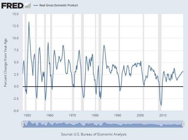
We can pretend the strength in EPS was because business has been booming during the “long economic expansion,” but it wasn’t. We got less production growth out of this expansion than in any other expansion in US history, and that is easy to prove with the Fed’s own data. GDP went up, but the rate of growth in GDP has been in secular decline during each expansion: (Expansion periods are the periods between the gray recession zones in the Fed graph below.)
Of course, those are percentage changes, and the higher any number gets, the harder it becomes to get as big of a percentage change off that number. So, not so horrible, right?
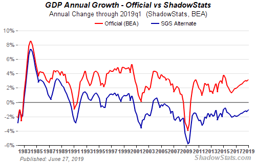
Well, the real numbers look worse because, you see, the government has changed the way it calculates GDP over the years to make things look better when measured against history. If you go back to tracking GDP the way it was historically calculated (if for no other reason than to keep the formula being used consistent across the chart), it looks like this: (Top line in the chart below is the line from the Fed chart above; bottom line is what you get if you stay with the same formula throughout the chart.)
Oops. Worse than pathetic. Using consistent accounting through time, we discover we have actually been in receding GDP (recession) since 2000 with the exception of one little bump in 2004. We don’t want to admit that, so we we’ll just ignore that by saying we improved our accounting methods over time.
And that is why I say “It’s been a great recession” because we never actually left the Great Recession. Rather than the longest expansion in US history, we’ve been enduring the longest recessionin US history ever since the dot-com bust. The above chart shows the GDP growth rate, and the REAL GDP “growth” rate, which has actually been contraction, not growth, for the past two decades if measured by historic standards. So long as GDP is growing, (above 0 on the chart above), we’re in expansion. Whenever GDP is shrinking (below 0 on the chart above), we’re in recession.
So, when you see financial commentators writing or talking about “the longest expansion on record,” this month, translate that in light of this article. It is only the longest expansion on record if you change the way you calculate GDP from the way previous records were calculated. It’s sort of like saying, “This person ran the longest marathon in history,” but not mention that we’ve reduced the length of the kilometer or mile by which we measure marathons.
The government (and the Fed) love to cook the books. They do it under the guise that old numbers really were not all that accurate, but if that were truly the reason, why is it the “corrections” and “adjustments” always serve to make the present regime’s numbers look better? (Perhaps people doing the calculations in the past were willing to be more conservative in terms of how much they patted themselves on the back for how well they were doing?)
Now you know why it doesn’t feel like things have really gotten any better for the average person. They haven’t. We’ve been living the last twenty years in a trickle-down recession that has only benefited the top 10%. Mostly, of course, the 1%.
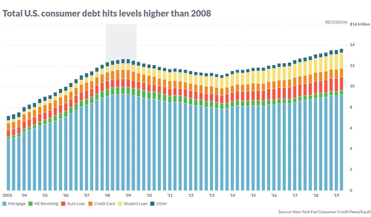
One would think we might have gotten a little extra lift in GDP percentage-wise for massive amount of extra debt we took on. It’s not just the government that saddled itself with a shipload of extra debt. Corporations did the same, and total individual debt is deeper now than before the official “Great Recession” hit:
Per capita, consumer debt may not be deeper, since the population has grown massively through immigration; but I’ve not been quoting per capita GDP here either. For all that debt, we have seen less GDP improvement (even by the official numbers) than at any time in the past hundred years; but it gets worse than that because we’re very proud right now of also attaining the lowest unemployment rate in history. So, let’s take a look at that number, too.
Employment in statistics … is a good profession
The main people assuring themselves of future employment are the statistic manipulators. They are kept well busy.
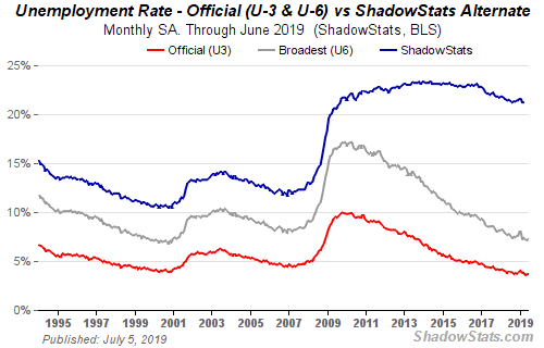
Unemployment only appears to be at its lowest ever, but unemployment truthfully remains quite bad. You see, most people fell off the unemployment charts years ago during this “expansion” because their unemployed was expanded for so long that they got lost. The financial reporters have forgotten about that, though most of them never noticed it in the first place; but I wrote about this statistical manipulation here for years at the beginning of the Great Recession, until I just got tired of saying it.
Falling out of the official statistics happens in three main ways:
1) You only remain counted in unemployment stats for as long as you keep actively seeking work and qualifying for benefits. Period. Multitudes gave up seeking work years ago and chose earlier retirement or death or …? The stats stopped counting them when they, for whatever reasons, stopped looking for work.2) You also fall off the list as soon as you use up all your available benefits because that is another way to no longer qualify. Millions used up all of their available benefits years ago.3) You fall off the list when you replace your former full-time job with part-time work.
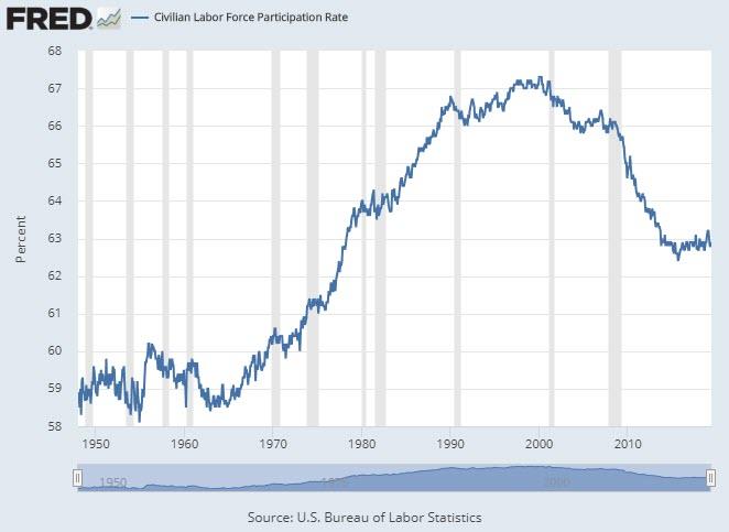
As a result we have the lowest labor participation rate in half a century. Even the Fed acknowledges that and pretends to be mystified as to why that is when it is as obvious as the gray hair on the Fed chair’s head.
All of that makes it easy to have an outstanding looking unemployment number that really is not representative at all of our labor situation.
REAL unemployment, factoring all of that back in, looks like the top line in the graph below: (The bottom two lines are the official measures of unemployment used by the US government and the Federal Reserve.)
The number of new jobs you keep hearing about is equally bogus, and I’ve pointed that out many times in the past, too. Now, however, as we crack open the champagne to celebrate the “longest expansion in history,” is a good time for a refresher on that.
We count part-time jobs as full-time jobs when we tally “new jobs,” but most of the new jobs created during this expansion were either part-time jobs that replaced full-time jobs or were jobs that offered lower pay or lower benefits. In fact, the number of part-time jobs in the economy is now 40% higher than it was the last time unemployment was this low! And those jobs typically don’t come with benefits and typically pay lower wages.
But it gets worse. Besides not counting new jobs in full-time equivalents, all of those new jobs are assumed to be additional people hired back into the labor force, but many were actually the same people counted twice! That is because they were people who went from holding one good full-time job to holding two part-time jobs in order to make ends meet, both of which offer no benefits and lower pay for each hour worked.
So, do you have to even wonder why it is we’ve seen the middle class deteriorate substantially during this great expansion? We’ve simply buried the truth in statistical smoke and mirrors.
Real wages have not gone up at all, so workers got no participation in the expansion. It all went to corporate owners, and with less disposable income workers certainly were not in a position to be investing in corporate ownership, other than in their retirement funds. So, maybe they benefited some there. Between the dot-com bust and the Great Recession, however, most laborers have barely made up for all that they lost in stock market excesses that were stripped away. If the present stock bubble bursts, they could easily wind up behind where they were two decades ago in REAL dollars.
(Stocks are way overpriced based on their CAPE average, which is probably the most historically accurate and meaningful average out there. So, yes, it’s a bubble. Many people are only willing to acknowledge bubbles after they burst, but I’m here to pop your bubble now.)
All Trumped up about nothing
Surely things have gotten better since Trump entered office, right?
According to the Congressional Research Services’ May, 2019, Report about the effects of the Tax Cuts and Jobs Act (a.k.a. the Trump Tax Cuts):
This analysis examines the preliminary effects of the Act during the first year, 2018.On the whole, the growth effects tend to show a relatively small (if any) first-year effect on the economy. Although growth rates cannot indicate the tax cut’s effects on GDP, they tend to rule out very large effects particularly in the short run. Although investment grew significantly, the growth patterns for different types of assets do not appear to be consistent with the direction and size of the supply-side incentive effects one would expect from the tax changes. This potential outcome may raise questions about how much longer-run growth will result from the tax revision.Real wages grew more slowly than GDP: at 2.0% (adjusted by the GDP deflator) compared with 2.9% for overall real GDP. Such slower growth has occurred in the past. The real wage rate for production and nonsupervisory workers grew by 1.2%…. While evidence does indicate significant repurchases of shares, either from tax cuts or repatriated revenues, relatively little was directed to paying worker bonuses, which had been announced by some firms.According to the National Income and Product Accounts (NIPA), actual growth rate [in 2018] was 2.9%, which is consistent with a small effect of the tax revision, perhaps even smaller than projected by most analysts…. The data appear to indicate that not enough growth occurred in the first year to cause the tax cut to pay for itself….CRS Report
But this year will come in better, right? Well, let’s see: the first quarter came in at about the same as that 2.9%, but pretty much everyone anticipates the second quarter is about to come in worse. I say, substantially worse. We shall see.
If so, it means the new tax program has accomplished all it ever will because it was supposed to build in its successes year after year. Let’s hope Larry Kudlow, who helped mastermind the new tax regime, gets on the microphone a little more often to talk this puppy into preforming. So far, not much bang for the buck; but, hey, at least we exploded the national debt out of earthly orbit forever! That’s something, right?
Still, lets see how the trickle-down Trump plan actually panned out for workers:
Distributional analyses of the tax change suggested that the tax revision favored higher-income taxpayers, in part because most of the tax cut benefited corporations and in part because the individual income tax cut largely went to higher-income individuals…. During the debate about taxes, however, arguments were made that these corporate tax cuts would benefit workers due to growth in investment and the capital stock…. In the absence of the tax cuts, wages should grow with the economy and wage rates should grow as the capital stock grows. In addition, tight labor markets resulting from the approach to full employment should have put upward pressure on wage rates in any case. Evidence from 2018 indicated that labor compensation, adjusted to real values by the price indices for personal consumption expenditures, grew slower than output in general…. There is no indication of a surge in wages in 2018 … compared to history or relative to GDP growth….Increased funds, whether accessed from abroad or through tax cuts, could be used in several ways: investment, paying down debt, increasing wages, paying wage bonuses, paying dividends, or repurchasing shares. During the passage of the tax revision and in the immediate aftermath, some argued that firms would use these funds to pay worker bonuses (as discussed in the previous section on wages). Subsequently, a number of firms announced bonuses, which in some cases they attributed to the tax cut. One organization that tracks these bonuses has reported a total of $4.4 billion.41 With US employment of 157 million, this amount is $28 per worker….Much of these funds, the data indicate, has been used for a record-breaking amount of stock buybacks, with $1 trillion announced by the end of 2018.CRS Report
What? It all went to the corporate owners? Who could have seen that coming?
I’m pretty sure that is precisely how I said two years ago this was going to turn out, and people just argued that I’m a Trump hater, not willing to give the plan a chance. (Actually, I just hated giving the government a chance to start racking up debt faster than our eyeballs can spin, knowing the benefits would all inure to the wealthy.)
Therefore, as my motto originally stated, “It’s been a great recession for a few.” That’s why I call my site “The GREAT Recession Blog.” For some it was great. Let’s do it all over again, so the good times can keep on rolling for the few and the mighty. That, of course, is exactly what the Fed plans to do by diving back toward zero-interest rates all over again. Therefore, to keep up with the times, I recently upgraded my motto to motto 2.0 for the Great Recession 2.0: “It was such a Great Recession, we’re heading back for more.”

No comments:
Post a Comment